New HTML Native Modals, Without the Fuss
📣 Sponsor
In modern application design, modals have become part of the fundamental design language that most users now understand intuitively. Despite this, there has been no native way to display modals on a website. The HTML <dialog> is a native HTML attempt to solve that.
Modal is more than just a new HTML tag. It comes with a Javascript API and some custom CSS. One of the coolest things it does is a new ::backdrop CSS property. No more pseudo elements or background covers.
Current Support
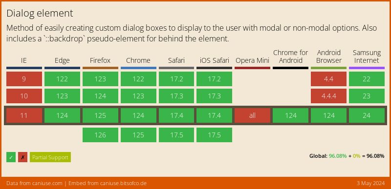
As expected, there are some gaps in support for this functionality, but it's not as bad as you might think. If you are working with electron or a blink based rendering engine, then you can use this today. Otherwise, you can do it today, you just have to use some kind of polyfill to make sure it works in other browsers.
The dialog tag
The dialog tag is a hidden element by default, as modals typically are. When given the attribute open, the dialog appears at the center of the page. Below the code, try clicking the "Show Dialog" button, to see how it works.
<!-- the below tag is not visible -->
<dialog>
    I am not visible
</dialog>
<!-- the below tag IS visible -->
<dialog open="true">
    I AM visible
</dialog>
Dialog comes with its own Javascript functions, the most important of which is showModal(). We can create a button which displays the dialog with only a few lines of Javascript. We have to use showModal() since if we don't, the backdrop will not appear. The current implementation is slightly confusing, since you can use show(), but it will lead to the backdrop not appearing.
    document.getElementById('button').addEventListener('click', function(e) {
        document.querySelector('dialog').showModal();
    });
    document.getElementById('close-'button').addEventListener('click', function(e) {
        document.querySelector('dialog').close();
    });
Try it out by clicking the button below:
The backdrop CSS
When we use showModal() to show a dialog tag, a backdrop will appear which by default has a very low opacity black color. We can customise this backdrop by using the ::backdrop pseudo tag. I've noticed while using this, that you have to use two colons for it to work, so don't forget to do that:
dialog::backdrop {
    background-image: linear-gradient(45deg, #1455f1, black);
    opacity: 0.6;
}
backdrop-filter
Along with this, we get a cool backdrop-filter tag which lets you apply a filter to text content appearing below the backdrop. For instance, you could invert the background using a standard CSS filter:
dialog::backdrop {
    opacity: 0.6;
    backdrop-filter: invert(1);
}
In Conclusion
Dialog is a brand new HTML tag in an age where web components have put an end to new tags. It does what you'd expect, and removes the annoyance from modal making - i.e. backdrops, extra CSS, and bespoke Javascript functions. Although not fully supported by all major browsers yet, expect to see this taking over modal development in the coming months and years.
More Tips and Tricks for HTML
- How to save HTML Canvas as an Image
- New HTML Native Modals, Without the Fuss
- Sure Fire Ways to Speed up Your Website
- Everything you need to know about HTML Input Types
- HTML tags for text
- How to Clear an HTML Canvas
- Creating Shapes with HTML Canvas
- Creating Dark Mode, for Lazy People
- Getting Started with HTML Canvas
- How to Add Images to HTML Canvas
