CSS Glass Morphism Generator
📣 Sponsor
The glass morphism effect is popping up all over the web at the minute. Although in the past it was generated mostly with images, we can now achieve the same result using CSS. The CSS glass morphism effect is pretty widely supported as well. Below, I've created a generator so you can make your own CSS glass morphism effects and add them to your applications and websites.
CSS Glass Morphism Generator
A little while ago I used the CSS glass morphism effect to create some apple UI elements. To show how this effect works a little better, I've created a CSS glass morphism generator below. You can change the options, and generate your own glass morphism along with code.
Since we are using mix-blend-mode to make our effect a little more blended, our text layer will have to sit in a separate div so it the blend mode is not applied to it.
Select Color
Select Opacity
Select Blur
Select Filter Effect
CSS for Glass Morphism Effect
#glass-object {
    border-radius: 25px;
    backdrop-filter: blur(10px);
    padding: 2rem;
    box-shadow: 0 2px 10px rgb(0 0 0 / 10%), 0 10px 15px rgb(0 0 0 / 20%);
    box-sizing: border-box;
    background-image: linear-gradient(45deg, rgba(66,60,90,0.6), rgba(66,60,90,0.6));
    width: 100%;
    height: 100%;
    mix-blend-mode: hard-light;
}
#text-layer {
    position: absolute;
    top: 0;
    left: 0;
    width: 100%;
    height: 100%;
    display: flex;
    align-items: center;
    justify-content: center;
}
#glass-container {
    position: relative;
    width: 100%;
    height: 80px;
}
HTML for CSS Glass Morphism Effect
<div id="glass-container">
    <div id="text-layer">
        This is your glass effect.
    </div>
    <div id="glass-object"></div>
</div>
How does CSS Glass Morphism work?
This effect is based off two CSS properties - mix-blend-mode, and backdrop-filter. The first, lets us blend our element with the element behind it. The second, lets us blur or add a filter to semi opaque backgrounds, so that the background behind the element can be filtered. We're using blur as our filter to create the glass effect, but others work too. To read more on this topic, try our other tutorial here.
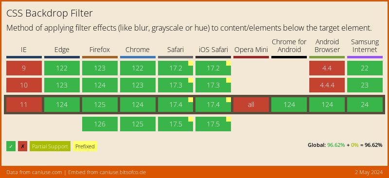
Support for Glass Morphism Effect
The glass morphism effect tends to degrade quite gracefully, as if it isn't supported, there simply isn't an effect displayed. It is broadly supported, however, as shown in the table below.
More Tips and Tricks for CSS
- Smooth CSS Gradient Transitions
- How to make a div the same height as the browser window
- How to vertically center text and HTML elements with CSS
- Multi colored text in CSS
- CSS Fonts
- The Interactive Guide to CSS Grid
- A first look at CSS When and Else Statements
- CSS Transformations
- CSS Individual Transform Properties
- CSS Introduction