A first look at CSS When and Else Statements
📣 Sponsor

In CSS, we make selections of different devices by using media queries. Media queries give us an easy way to select a devices based on numerous conditions, such as screen size, pixel density, or even format: i.e. print or screen.
This has progressively gotten more complicated over time, and now we are often balancing many conditions that sometimes conflict with each other.
The new CSS Conditional Rules 5 Specification tries to resolve this problem, by introducing two new ways to do media queries - @when and @else. These will finally allow us to create conditional statements directly in vanilla CSS. Let’s take a look at how it works!
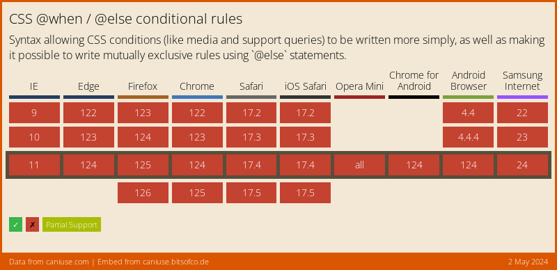
@when/@else support
Currently, no browsers natively support @when/@else, however that is likely to change soon. Full support for @when/@else is shown below.

Using @when/@else in CSS
Let’s suppose we have one set of rules which we want to apply to screen sizes less than 780px wide which supports display: flex, and another which should apply to anything apart from that. Previously, we would have to use @media queries to select for both of those things separately. This became a little bit messy when selecting for multiple different things. With @when and @else it looks like this:
@when screen and (max-width: 780px) and supports(display: flex) {
    .my-element {
        color: red;
        display: flex;
    }
}
@else {
    .my-element {
        display: block;
    }
}
We can also chain multiple conditions. For example, let’s say we have three scenarios: screens with a max width of 780px that support display: flex, screens larger that support display: flex, and everything else. In that case, we can have multiple conditions:
@when screen and (max-width: 780px) and supports(display: flex) {
    .my-element {
        color: red;
        display: flex;
    }
}
@else screen and supports(display: flex) {
    .my-element {
        display: flex;
    }
}
@else {
    .my-element {
        display: block;
    }
}
As you’d expect, we can have even more @else statements, but the above gives you an idea of how useful both @when and @else will become when implemented in CSS.
Conclusion
Conditional statements have never been in vanilla CSS, so it’s great to finally see them coming soon. It’s also going to greatly simplify how we make media queries. We already have logic in CSS if we use third party packages like SASS, but when it comes natively to CSS, we can avoid the need to use a pre-processor or build with this addition.
More Tips and Tricks for CSS
- How to do Deletion Animations with CSS
- CSS Glass Morphism Generator
- Stripe-Like Smooth Transition CSS Only Menu
- A first look at CSS When and Else Statements
- CSS Animations
- Sticky Positioning with CSS
- CSS Units
- CSS Layers Tutorial: Real CSS Encapsulation
- How to Create Animated Cards with WebGL and Three.js
- CSS Inset Borders at Varying Depths