CSS 3d Mosaic Parallax Effect
📣 Sponsor
Parallax Effects have been popular on the internet since CSS allowed for reliable transformations, however mostly for scroll effects. As such, I was thinking of ways to reimagine this effect to make it more interactive.
This CSS mosaic effect is the end product:

Although this is initially a normal image, you can drag it to create a 3d Parallax effect
View the DemoLayers
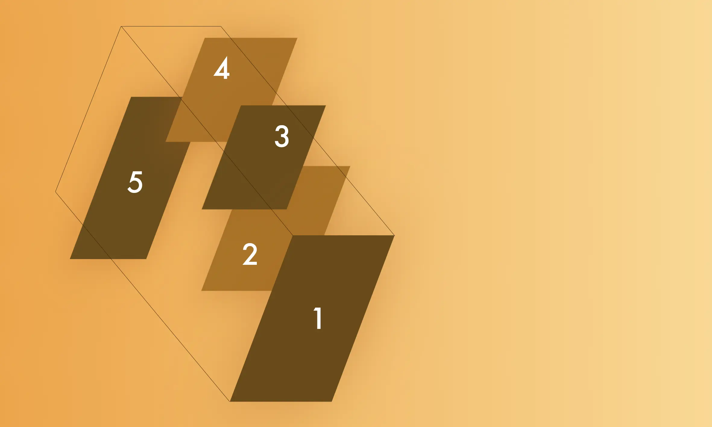
The basic premise of this effect is we will create multiple layers of the same photo, line them up correctly, and put them into 3D space. Here is a sample of the images lined up from an angle:

This can be automated, but doing it manually can give the photo a bit more of a 'sutured' or 'mosaic' effect, which looks quite nice. I am using a total 5 images. We also have two divs:
- #rotator - to control rotation (duh)
- #container - to control zoom (less obvious)
Our HTML code ends up looking like this. Note I have also put in a 'glitch' version of the image, for a subtle effect when we drag.
    <div id="container">
        <div id="rotator">
            <div class="image">
                <img src="images/girl.jpg" alt="">
                <img src="images/girl.jpg" class="glitch" alt="">
            </div>
            <div class="image">
                <img src="images/girl.jpg" alt="">
                <img src="images/girl.jpg" class="glitch" alt="">
            </div>
            <div class="image">
                <img src="images/girl.jpg" alt="">
                <img src="images/girl.jpg" class="glitch" alt="">
            </div>
            <div class="image">
                <img src="images/girl.jpg" alt="">
                <img src="images/girl.jpg" class="glitch" alt="">
            </div>
            <div class="image">
                <img src="images/girl.jpg" alt="">
                <img src="images/girl.jpg" class="glitch" alt="">
            </div>
        </div>
    </div>
For the CSS, the key thing to note is that we need to add transform-style: preserve-3d to ensure we can rotate and preserve the 3d space in the way we want to.
After that, it is just a case of moving the images into place.
#container, #rotator {
    transform: scale(1);
    width: 60%;
    transform-origin: 24% 33% -500px;
    position: relative;
    transform-style: preserve-3d;
    position: absolute;
    perspective-origin: 50% 15%;
    width: 100%;
    top: 9rem;
    height: 100%;
    cursor: grab;
}
#container .image:nth-of-type(2) {
    transform: scale(0.5) translateZ(-300px) translateY(-300px) translateX(70px);
    transform-origin: 0 0;
    width: 500px;
    height: 500px;
}
#container .image:nth-of-type(2) img {
    width: 930px;
    top: -250px;
    left: -12px;
    position: relative;
    transform: translateZ(-100px);
}
#container #rotator .image:nth-of-type(2) .glitch {
    width: 930px;
    top: -265px;
    left: -17px;
    transform: translateZ(-100px) translateX(-5px) translateY(-5px);
}
Javascript
For the Javascript we are going to be performing a couple of events:
- Wheel - to zoom in and out of the 3D space.
- Pointerdown - to trigger the drag event.
- Pointermove - to alter the rotation based on the drag.
- Pointerup - to end the drag event.
Since we segregated our elements into a rotational div and a zoom div, we can do both of these things with very little complexity. All we need to do is track the delta for each. Check the comments below for more information.
    document.addEventListener('DOMContentLoaded', function(e) {
        // Track the scale
        let scale = 1;
        // Zoom event
        document.body.addEventListener('wheel', function(e) {
            // Prevent zoom from getting out of control
            if(scale >= 0.4 && scale <= 1.8) {
                scale = scale - (e.deltaY / 500);
            }
            if(scale < 0.4) {
                scale = 0.42;
            }
            if(scale > 1.8) {
                scale = 1.78;
            }

            // Update CSS
            document.getElementById('container').style.transform = `scale(${scale})`;
        });

        // Tracking variables
        let drag = false;
        let startPointY = 0;
        let startPointX = 0;
        let currentRotationY = 0;
        let currentRotationX = 0;

        // When the user clicks or touches the object
        document.body.addEventListener('pointerdown', function(e) {
            // Set dragging to true
            drag = true;
            startPointY = e.pageX;
            startPointX = e.pageY;
            // We break open the transform property to get the rotateX and rotateY values
            if(typeof document.getElementById('rotator').style.transform.split('rotateY(')[1] !== "undefined") {
                currentRotationY = parseFloat(document.getElementById('rotator').style.transform.split('rotateY(')[1].split(')')[0]);
            }
            if(typeof document.getElementById('rotator').style.transform.split('rotateX(')[1] !== "undefined") {
                currentRotationX = parseFloat(document.getElementById('rotator').style.transform.split('rotateX(')[1].split(')')[0]);
            }
        });

        // For pointer up or pointer leave events, rotating/drag has ended
        ['pointerup', 'pointerleave'].forEach(function(item) {

            document.body.addEventListener(item, function(e) {
                drag = false;
                document.getElementById('rotator').classList.remove('rotating');
            });
        });

        // If the user is moving..
        document.body.addEventListener('pointermove', function(e) {
            let changeY = (e.pageX - startPointY) / 5;
            let changeX = (e.pageY - startPointX) / 5;
            // If they have clicked, then they are dragging the object
            if(drag == true) {
                // Update the transform with the correct rotations
                document.getElementById('rotator').classList.add('rotating');
                document.getElementById('rotator').style.transform = `rotateY(${changeY + currentRotationY}deg) rotateX(${-changeX + currentRotationX}deg)`;
            }
        });
    });
All Done
And with that we're done. This effect looks great as the main intro hero image for a product or service website, although it can be used in more creative ways in different spaces too. Hope you've enjoyed! Here are the resources:
More Tips and Tricks for CSS
- Smooth CSS Gradient Transitions
- CSS 3d Mosaic Parallax Effect
- Creating a Javascript Drawing and Annotation Application
- CSS Units
- A Complete Guide to How the CSS not Selector Works
- Using Only CSS to Recreate Windows 98
- Centering Elements in CSS with Tailwind
- How the CSS Box Model Works
- CSS Positioning
- How to Animate SVG paths with CSS