CSS Only Masonry Layouts with Grid
📣 Sponsor
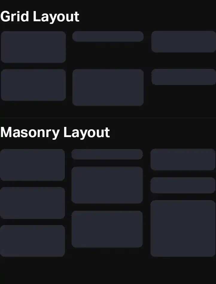
Masonry is something that for years the web has struggled with but has found no real meaningful native solution. In web development and application building, masonry refers to the type of layout which is most famously used on Pinterest, where elements 'fill' the gaps underneath them. This differs quite a lot from flex or grid, which have fixed row width.
There are many ways to implement masonry today with Javascript, and there is even a hugely popular Javascript Masonry plugin. A truly native CSS solution has always been lacking, though. Today, a new specification is being developed to bring native masonry straight to CSS, with no Javascript required. In this article we'll be covering CSS masonry.

Creating Masonry with CSS Masonry
The CSS Working Group has now created a proposal for masonry with just CSS, using just a few lines of code, which will work both on the horizontal and vertical axis.
.container {
    display: grid;
    grid-template-columns: 20% 20% 20% 20%;
    grid-template-rows: masonry;
    align-tracks: start; // A new masonry only property
    justify-tracks: start; // A new masonry only property
}
The masonry specification will also introduce two new properties: align-tracks, and justify-tracks. These will work in much the same way as align-content and justify-content, accepting values start, end, center, stretch, space-between and space-evenly.
Although currently in the proposal stage, masonry is pretty hard to standardize. For example, should items auto fill gaps? How do you manage order? Or what order should a screen reader read the boxes in?
Due to all these uncertainties, there is no support for CSS masonry in any modern browser, as the specification may change. Ultimately, that means we can't generate reliable masonry with just CSS today.
The Debate on CSS Masonry as a Grid Feature?
Whether CSS masonry fits in the grid specification is up for debate. Grids, by their own nature, are fixed structures. It is questionable if the grid specification is the right place to put masonry at all.
In CSS, a grid has rows, which items can be assigned to. If we decide to turn that into masonry, items would be able to overlap rows and be assigned to different rows at the same time.
In some ways, masonry fits much better in the CSS flexbox specification, since masonry columns and rows are much more like flexbox columns and rows. Flexbox even sounds about right - a box that flexes could flex both vertically and horizontally.
Regardless of the right place to put CSS masonry, today we have to use other methods to implement it in our applications.
Implementing Masonry Today with Javascript
Since native and widely supported CSS masonry is out of reach, implementing masonry today requires a little Javascript. Luckily it's not as hard as you think. Masonnry usually does a few things:
- Fill in the gaps
- Adjust automtically to CSS changes
- Create a container of the correct height
Although this is a static implementation, you could re-run the Javascript to update should more items be added.
It is possible to do this with just CSS as shown here, although adding some Javascript gives us a solution which is much more flexible than current CSS implementations can achieve.
Using roughly 35 lines of Javascript, we can recursively put all divs within an element into masonry. We can also identify which columns items fall into, and set the max height of the container.
A full demo can be viewed below. You can find the full code on CodePen here..
let mainId = 'masonry-effect';
let itemIdentifier = '#masonry-effect .item';

document.addEventListener('DOMContentLoaded', function(e) {

    // Programmatically get the column width
    let item = document.querySelector(itemIdentifier);
    let parentWidth = item.parentNode.getBoundingClientRect().width;
    let itemWidth = item.getBoundingClientRect().width + parseFloat(getComputedStyle(item).marginLeft) + parseFloat(getComputedStyle(item).marginRight);
    let columnWidth = Math.round((1 / (itemWidth / parentWidth)));

    // We need this line since JS nodes are dumb
    let arrayOfItems = Array.prototype.slice.call( document.querySelectorAll(itemIdentifier) );
    let trackHeights = {};
    arrayOfItems.forEach(function(item) {
        // Get index of item
        let thisIndex = arrayOfItems.indexOf(item);
        // Get column this and set width
        let thisColumn = thisIndex % columnWidth;
        if(typeof trackHeights[thisColumn] == "undefined") {
            trackHeights[thisColumn] = 0;
        }
        trackHeights[thisColumn] += item.getBoundingClientRect().height + parseFloat(getComputedStyle(item).marginBottom);
        // If the item has an item above it, then move it to fill the gap
        if(thisIndex - columnWidth >= 0) {
            let getItemAbove = document.querySelector(`${itemIdentifier}:nth-of-type(${thisIndex - columnWidth + 1})`);
            let previousBottom = getItemAbove.getBoundingClientRect().bottom;
            let currentTop = item.getBoundingClientRect().top - parseFloat(getComputedStyle(item).marginBottom);
            item.style.top = `-${currentTop - previousBottom}px`;
        }
    });
    let max = Math.max(...Object.values(trackHeights));
    document.getElementById(mainId).style.height = `${max}px`;
});
#masonry-effect {
    display: flex;
    flex-direction: row;
    flex-wrap: wrap;
}
.item {
    flex-direction: column;
    margin-right: 1rem;
    margin-bottom: 1rem;
    position: relative;
    width: calc(33.3% - 1rem);
    background: linear-gradient(45deg, #281dd4, #a42bff);
    border-radius: 10px;
    padding: 1rem;
    font-size: 1.25rem;
    box-sizing: border-box;
    font-weight: 600;
}
Simple Masonry Demo
Conclusion
In conclusion, today, masonry can be achieved with some very lightweight Javascript, and in a few years we may have a native CSS solution. I hope you find this page useful!
What do you think of masonry in CSS? Let me know your thoughts on twitter.
More Tips and Tricks for CSS
- How to do Deletion Animations with CSS
- Making 3D CSS Flippable Cards
- Sticky Positioning with CSS
- CSS Layers Tutorial: Real CSS Encapsulation
- Creating a Javascript Drawing and Annotation Application
- CSS Media Queries
- CSS Colors
- CSS States
- CSS Introduction
- A Complete Guide to How the CSS not Selector Works